


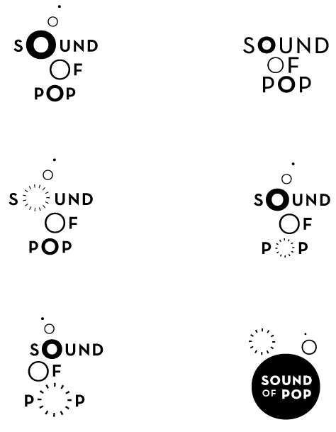
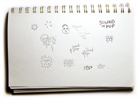
Sound of Pop is an independent record label as well as a music publishing and licensing company based in Nova Scotia, Canada. Glenn who runs the label, has an energetic, positive way about him that comes out in every aspect of his company. This logo attempts to embody those characteristics.
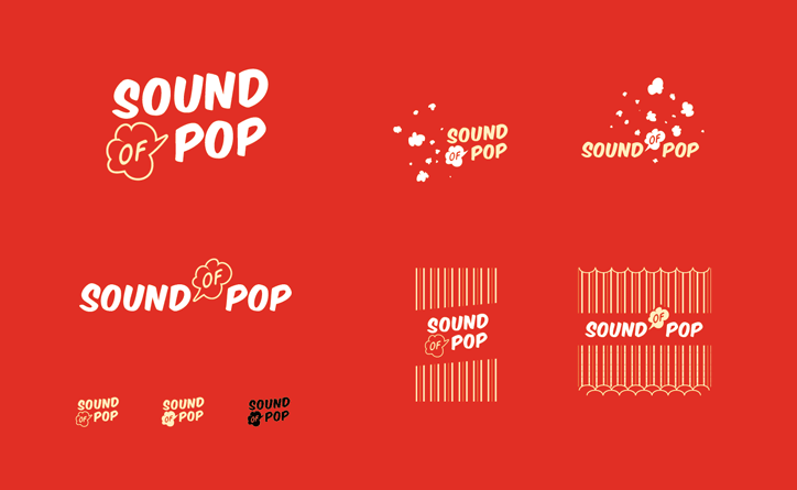
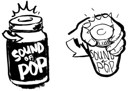
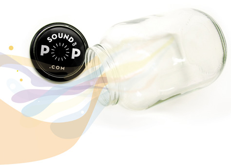
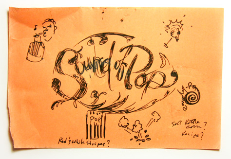
My favourite idea early on was the ‘sound of pop’ coming from a sealed jar opened for the first time. It spoke of fresh contents, which was a good fit for a label holding music. In the end I scrapped this idea, but the lid’s round shape did find it’s way into the final version.
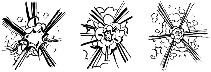
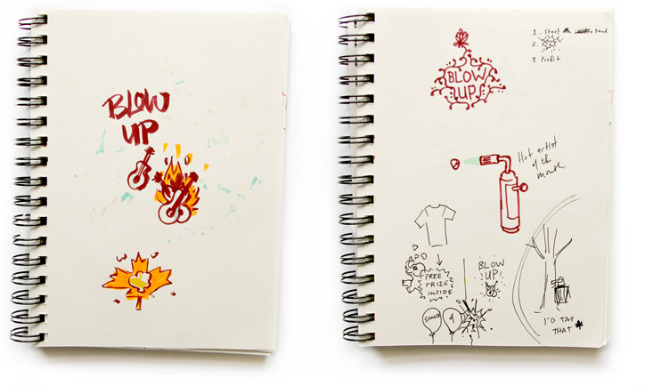
Another early theme was a kernel of corn popping. I liked the iconic look of red and white striped popcorn bags. The nostalgia factor was there well. I even proposed the idea of mailing promotional popcorn samplers with a prize inside.
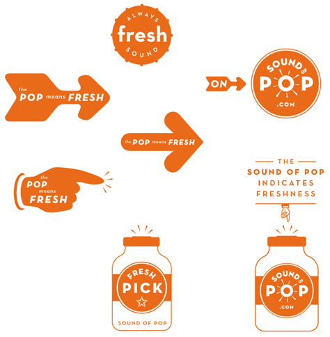
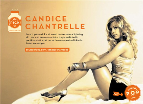
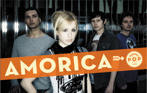
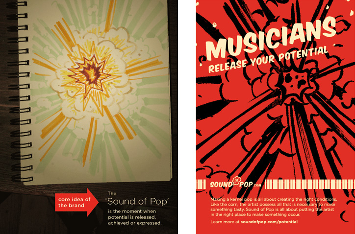
Sometimes it takes a lot of work to get somewhere simple. This was definitely one of those times, though I feel the best logo won in the end. The clincher for me is it’s versatility. It will remain identifiable even when placed on top of a musician’s photo. It’s like a badge.
This logo went hand-in-hand with the Sound Of Pop website redesign.
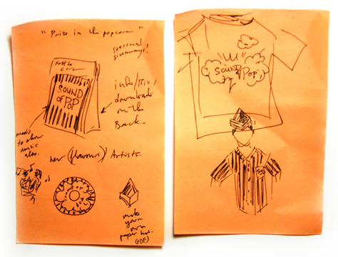
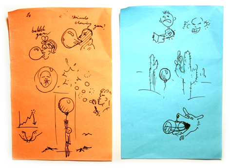
A plethora of early sketches for the logo. Some are even a bit ‘corny’.
Pretty cool to see the process involved in logo design even when you’re used to doing it yourself. Like a view inside another person’s mind. Great sequence and pretty cool solution Simon!